Dropped Line Indentation
- Published on:
- Categories:
- Typography 11, CSS 97
- Current music:
- The Album Leaf —
Cycles
- Current drink:
- Infusion of hibiscus, apples, rosehip, and orange peels, with cherry flavor.
Introduction
I originally drafted this post two years ago, after publishing an observation about the “forced wrapping”. In August of that year, I stumbled upon a solution (or so I thought) for one particular problem. A problem that I, among others, tried to solve in CSS for quite a while.
The problem is: how to do a dropped line in CSS? What is it? Let me quote from Wikipedia:
In poetry, a dropped line is a line which is broken into two lines, but where the second part is indented to the horizontal position it would have had as an unbroken line.
Here is an example from that page that uses the technique that I came up with in 2024:
It's linkage I'm talking about, and harmonies and structures,
And all the various things that lock our wrists to the past.
Something infinite behind everything appears, and then disappears.
I remember thinking about how to achieve this effect when I first read “The Elements of Typographic Style” by Robert Bringhurst around twelve years ago, but at the time I did not come up with anything clever to solve that.
At some point later, I read about this in Richard Rutter’s “The Elements of Typographic Style Applied to the Web”. It did not propose a good solution as well, coming up with a very similar result as my experiments — using incremental relative positioning, and claimed that
Unlike other styles mentioned, dropline paragraphs for long pieces of text are impossible to achieve consistently in CSS without exorbitantly long CSS files or (preferably) the aid of JavaScript.
If you don’t know me, you might not know how I like to go into “impossible” problems.
But, it did turn out, the solution that I found ended up being relatively simple… But not really working.
The Faux “Dropped Line” Technique
To repeat the above example, alongside the corresponding HTML and CSS code:
It’s linkage I’m talking about, and harmonies and structures,
And all the various things that lock our wrists to the past.
Something infinite behind everything appears, and then disappears.
<div class="drop-lined">
	<p><span>It’s linkage I’m talking about,</span> <span>and harmonies and structures,</span></p>

	<p>And all the various things that lock our wrists to the past.</p>

	<p><span>Something infinite behind everything appears,</span> <span>and then disappears.</span></p>
</div>
.drop-lined span {
vertical-align: top;
&:not(:first-of-type)::before {
content: "\A\2060";
white-space: pre;
display: inline-block;
}
}How Does It “Work”?
The important parts:
-
Each part of the paragraph, on both sides of the “break”, needs to be wrapped in an inline element, in our case —
<span>. -
This inline element needs to have
vertical-align: top. -
For each non-first span, we add an inline-block
::beforepseudo-element with some very specificcontentandwhite-space: pre. -
That
contentconsists of an escaped newline symbol followed by an escaped “word joiner” symbol.
This is how this works. But why? Let me quote the spec for the top value of vertical-align:
Align the line-over edge of the aligned subtree with the line-over edge of the line box.
Ok, maybe this is not very clear… I don’t know if there is a good explanation of how exactly read this…
And that’s where I stopped writing this post when I last tried to finish it, as by trying to understand and explain what exactly was happening, I realised it does not work.
Why This Is Not It?
While the above example did work, to see where it won’t work let’s look at this example — three lines from [Audre Lorde](Audre Lorde)’s poem “Memorial III — From a Phone Booth On Broadway”.
that works
quick
quick
I must call you
now
Well, this does not work! Here is how it was in print:
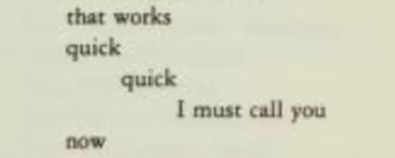
The technique in the above example worked, but only once — there is a drop after the first “quick”, but not after the second.
When the sentences were long, that semi-working technique worked because there was only one drop per line box. And the way technique worked is that it aligned the first part at the top, then inserted a dropped line, and this whole “block” that included the line drop was still aligned to the top — but not relative to the preceding text, but to the whole line box.
And because in each of the two spans with the inserted pseudo on one line the newline was inserted only once, that’s how far from the top of the line box they were aligned.
Oh well! A good part about this technique — it has good browser support, and for longer lines it can be used pretty effectively.
Proper “Dropped Line” Technique
After putting the draft of this post back into the drawer, and finishing a replacement post I published on that day, I went to sleep.
And, of course, in bed, I came up with a way to solve this properly. Well, “properly” — the technique is a bit hacky and requires very modern CSS features — sibling-index() and sibling-count().
Look:
that works
quick
quick
I must call you
now
.dropped-line {
	display: block;

	& > span {
		position: relative;
		top: calc((sibling-index() - 1) * 1lh);

		&:last-child::after {
			content: "";
			display: block;
			height: calc((sibling-count() - 1) * 1lh);
		}
	}
}And this still works with the longer sentences, here is our first example, but using the new technique:
It's linkage I'm talking about, and harmonies and structures,
And all the various things that lock our wrists to the past.
Something infinite behind everything appears, and then disappears.
And How This Works?
Well, it is pretty simple, and is in line with both how Richard was trying to do it, and how I experimented with it a long time ago — using position: relative, but where previously we did not have a lh unit, as well as sibling-index() and sibling-count() functions, now we can use those to achieve what we need:
-
lhunit is great to get the value of our line-height (although, we need to note that this is only a metric, and not the actual rendered height of the line box, as it can be modified by various things — I recommend “Deep dive CSS: font metrics, line-height and vertical-align” article by Vincent De Oliveira about this). -
sibling-index()allows us to incrementally shift each consequtive fragment as a whole — be it a single word or a sentence, we just need to wrap each full fragment with a span. -
Because we’re using
position: relative, our layout around the shifted lines does not know that it needs to adjust to this. But what we can do is insert a pseudo-element after our last inline fragment, make it block, and give it the height equal to the accumulated shift, which we can know due tosibling-count()and how it evaluates on pseudo-elements — it uses the value from the originating element. And a block element “drops” from the inline one, giving the vertical space between our fragment and anything that follows it.
Browser Support and Fallbacks
Above examples work only in browsers that support sibling-index() and sibling-count() — and those are “baseline available” since August 2026 — but, of course, older browsers won’t get anything. It won’t break, and the text will just go in one line.
I did not add any workarounds for that in this post, but if you really want those, I wrote an article about this: “Possible Future CSS: Tree-Counting Functions and Random Values” in 2024.
That’s It!
I think that CSS for typesetting poetry can be really interesting. When you look at the old books, or how people used typewriters to format stuff, not everything can be moved to CSS in any straightforward way.
When I was doing research for the examples in this article, I stumbled upon so many places where in modern editions or reprints of various poetry that relied on indentation, the final indentation did not look good, was fully absent, or looked not as intended. I wish more people explored how to reproduce those previously print-only techniques on the web, so we could preserve the original visual intent.
And, on a completely unrelated note, I cannot not link to “Poetic CSS” — course from Miriam Suzanne about CSS. I did not go through it, but when thinking about poetry and CSS I could not remember that Miriam has it! And her stuff is always great.